A Guide to Using A+ Content
Last week, Ginger discussed Amazon’s A+ Content and how it can amplify the conversion rate of visitors to your product page into buyers of your book. This time he’s going deeper, with a more tactical discussion of using A+ Content to elevate the visual and textual presentation of your book. Through practical examples, Ginger demonstrates the variety of available modules and how they can be used to go beyond the standard book description and provide a richer, more engaging experience for potential readers.
From compelling text modules that highlight key selling points and author insights to visually striking image options and interactive features, A+ Content serves as your palette to paint a more enticing picture of your work. In a marketplace where differentiation is key, leveraging these tools can be the decisive factor in making a sale and earning yourself a lifelong fan of your work.
Last week, I wrote a blog called Amplify Your Conversion Rate with KDP’s A+ Content and I wanted to follow it up with slightly more tactical advice about using each of the different content modules that are available to you.
And use them you should! Because in the bustling marketplace of self-publishing, the product page of your book on Amazon is its prime real estate – and just like in those house flipping shows on HGTV, success is all about “curb appeal.”
Amidst a sea of competitors and tens of millions of books jostling for visibility, authors need to grab a reader’s attention and convince them to click “Buy Now” as quickly and effectively as possible – and because Amazon’s A+ Content modules enhance the “curb appeal” of your product page, they’re incredibly powerful tools to help give you an edge in achieving that.
A+ Content allows you to add enhanced visual and textual modules to your book’s product page that go beyond the basic description that most self-published authors are familiar with. These modules showcase your book in a more engaging and informative way and – more importantly than that – using A+ Content will allow your self-published book to match the look and aesthetic of traditionally published books, which can be an important differentiator for potential customers.
In short: By using A+ Content strategically, you can increase your book’s visibility on Amazon, improve conversion rates when advertising, and ultimately, sell more copies of your books!
The Different A+ Content Modules
My last blog post was fairly strategic, so let’s get tactical. First, you’ll need to navigate to your Kindle Direct Publishing Marketing Manager.
Once there, click on “A+ Content” to begin creating your new content. You’ll have to select the marketplace you’ll be adding them to, and for most of us that will Amazon.com.

From there, we can dive into the different A+ Content modules available to self-published authors and explore how you can leverage each one for maximum impact.
Text Modules
Standard Product Description Text modules are simple, highlighted segments in which you can add boxes of rich text to your product page. Text modules are great for providing bite-sized information that’s easy to digest. They break up the visual space and allow you to emphasize specific aspects of your book without overwhelming readers with lengthy text.

Why should you use them?
- Text Lineup: This module is a versatile workhorse. Use it for short, attention-grabbing blurbs that highlight key selling points like genre, awards, or unique aspects of your book. You can also use it for concise character introductions or even a captivating opening line to pique the reader’s interest.
- About the Author: Connect with your readers on a personal level. Briefly introduce yourself, your background, and your inspiration for writing the book. Sharing a captivating author bio can build trust and encourage readers to explore your other works.
- Key Product Features: This module allows you to create bulleted lists highlighting the core benefits of your book. Whether it’s a gripping plot, insightful advice, or beautiful illustrations, showcase what makes your book stand out.
Image Modules
Visuals are a powerful tool for grabbing attention and conveying information quickly. Images can evoke emotions, set the tone for your book, and showcase its visual quality (especially important for picture books or graphic novels).
Single Image: Showcase your book cover in all its glory. Consider using a high-resolution image with a clean background to ensure it pops on the page.
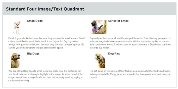
Multiple Images: This module lets you tell a visual story. Use a combination of character portraits, settings, or even thematic images to give readers a glimpse into the world of your book. You can use pictures on their own, or there are options to include text along with each image.

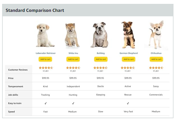
Comparison Chart: This is an especially powerful tool for non-fiction books. You can create a chart that compares your book’s approach to similar titles, highlighting its unique strengths or focus areas. Alternatively, if you have more than one book in your catalog, you can think of original ways to showcase them side-by-side.
Interactive Modules
Interactive modules like the Comparison Chart create a dynamic experience for readers. They can boost engagement, highlight positive feedback, and incentivize purchases during promotions by getting potential readers to click things and interact with your content. These can be especially powerful if you’re enrolled in KDP Select, as you can amplify the effectiveness of the promotional tools KDP offers authors.
- Countdown Deal: If you’re running a promotional offer, leverage this module to create a sense of urgency and encourage immediate purchase.
- Customer Reviews & Star Ratings: Let social proof work its magic. Displaying positive customer reviews and high star ratings builds trust and convinces potential buyers that your book is worth their time.
Crafting Compelling A+ Content: Best Practices
Using A+ Content modules allows you to transform your book’s product page from a static listing into a dynamic and informative platform – but for a lot of authors, it’s quite difficult to know where to start with all these options available to you. Here’s some advice: Remember that the goal of your A+ Content is to provide potential readers with a compelling reason to choose your book instead of clicking on the BACK button.
Here are some tips:
- Target the Right Audience: Consider who your ideal reader is and tailor your content accordingly. Use language and visuals that resonate with their interests.
- Maintain Visual Cohesiveness: Use a consistent color scheme, font style, and image quality throughout your A+ Content. This creates a professional and polished look.
- Focus on Benefits, Not Features: Don’t just list features; tell readers how your book will benefit them. Will it make them laugh? Teach them a new skill? Transport them to another world?
How are other authors using A+ Content?
Here are some great examples of how some best-selling authors are currently using A+ Content modules.
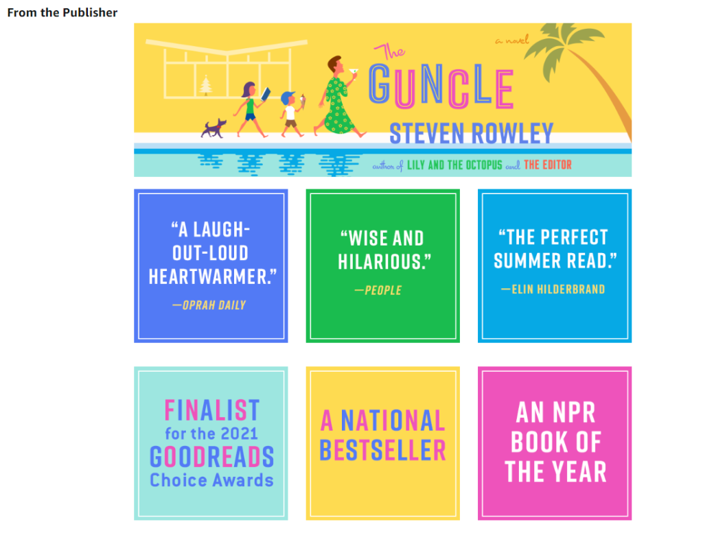
The Guncle by Steven Rowley is Wall Street Journal Bestseller and finalist for the 2021 Goodreads Choice Awards – and makes great use of Multiple Image Modules to give the product page a bright and colorful appearance and demonstrate the “social proof” of positive reviews.
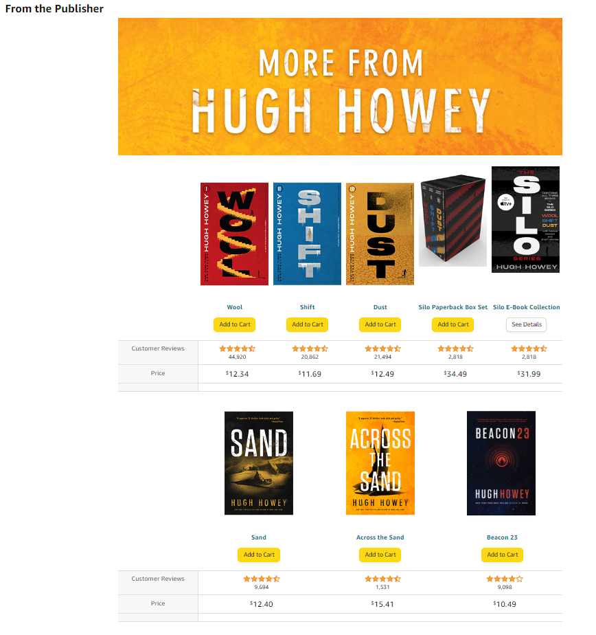
Book Three of Hugh Howey’s highly acclaimed Dust series uses the Interactive Comparison Chart to showcase other books in the series and by the author, essentially turning Book Three’s product page into an ad for the whole series!
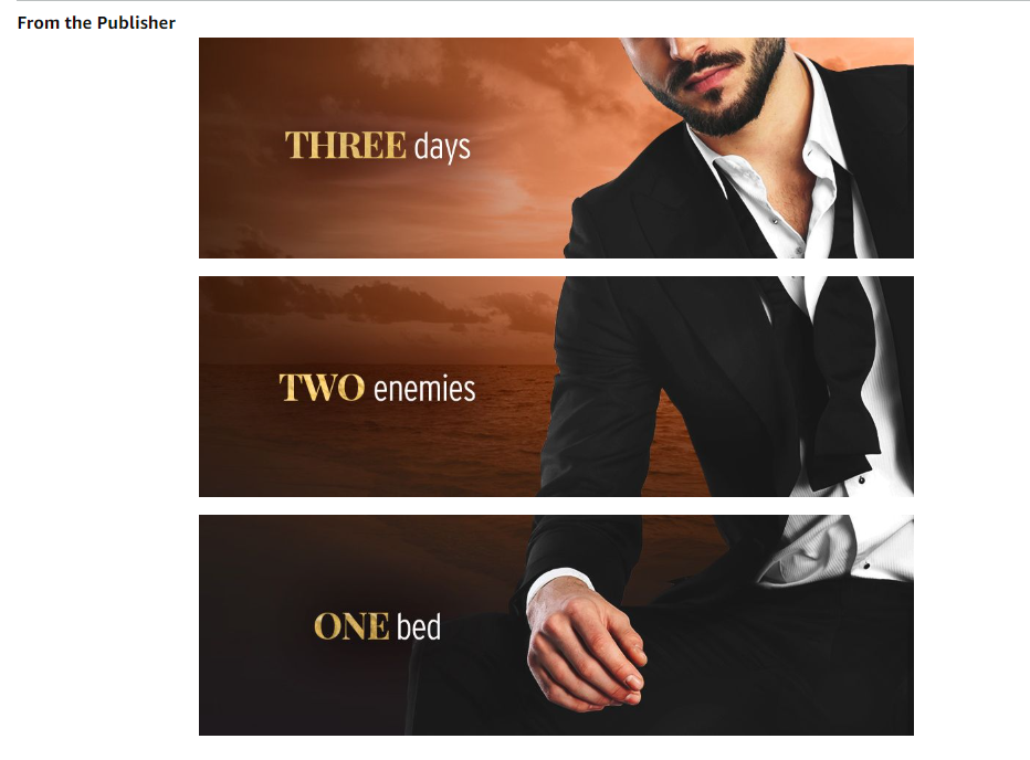
Pippa Grant’s The Worst Wedding Date has earned nearly 20,000 reviews, and makes innovative use of three separate Image Modules to plaster her leading man across her product page. I love this approach, as it’s very visually striking.
Taking Your A+ Content to the Next Level
As you start plotting out how you could use A+ Content for your own books, here are some suggestions:
- Series Showcase: If you’ve written a series, use A+ Content to showcase the entire collection. This can entice readers to explore your complete works.
- Sneak Peeks: Offer a taste of your writing by including an enticing excerpt from your book.
- Behind-the-Scenes Content: For non-fiction books, include charts, graphs or diagrams relevant to your topic. This showcases your expertise and adds depth to your content.
Optimizing for Mobile
Don’t forget that a significant portion of Amazon browsing happens on mobile devices! That’s why you need to ensure your A+ Content displays well on smaller screens. Use clear, concise text, high-resolution images optimized for mobile viewing, and avoid overly complex layouts.
A+ Content for Different Book Types
The mechanics of the A+ Content modules remain the same no matter what kind of book you’re using them with – but consider tailoring how you use them depending on what type of book it is.
- Fiction: Focus on character introductions, captivating excerpts, and mood-setting visuals. Fiction is often sold because of the way it makes a potential reader “feel” – so don’t waste the opportunity to set the tone for your book or series.
- Non-Fiction: Most non-fiction readers want a solution to a problem. That’s why you should use A+ Content to highlight key takeaways from your book. Suggestions include adding relevant charts or diagrams, and showcasing your author expertise through “About the Author” and “Behind the Scenes” modules.
- Children’s Books: Use high-quality illustrations, include interactive elements like “Countdown Deals” for special offers, and consider featuring positive and reassuring customer reviews from parents.
Is A+ Content Worth The Effort?
The “Gold Rush” days of self-publishing are over, and now things have become more competitive than ever. However, A+ Content presents a powerful opportunity to differentiate your book from all the others, and connect with potential readers on a deeper level.
And the good news is that a surprisingly small number of self-published authors are actually taking advantage of A+ Content right now – so you’re ahead of the crowd if you jump into using it.
By leveraging the various modules strategically and tailoring your content to your specific book and audience, you can create a product page that really stands out from the crowd and compels readers to hit the “Buy Now” button and take a chance on your work.
Just remember that using A+ Content is an ongoing process – you shouldn’t just create something, throw it up, and consider your job done. Experiment with different approaches over time, track the results, and refine your approach to continuously improve your book’s online presence and maximize your sales potential.
The advantage of experimenting with A+ Content is that a lot of the creative ideas you unleash can then be repurposed in your advertising, marketing, and promotional materials. So, unleash your creativity, utilize these powerful modules, and watch your self-published masterpiece stand out on the digital bookshelves!
Additional Resources: Here are two pages Amazon have provided to help you get started!


A few guides I’ve read, including this one, mention carousels, interactive modules, and other things which simply do not appear in the list of ‘standard modules’ within my A+ content area. This has been super frustrating and, after some googling, I (think) I understand that some modules are premium and some are standard, and that certain conditions must be met to unlock premium. It would be good if such info was included in such an article, with some pointers about how to access the premium tier.